Code Snippets
In this section, we will provide you with some code snippets from our Flutter templates. These snippets will help you understand how to work with our templates and how to customize them to your needs.
The Bottom Navigation Bar

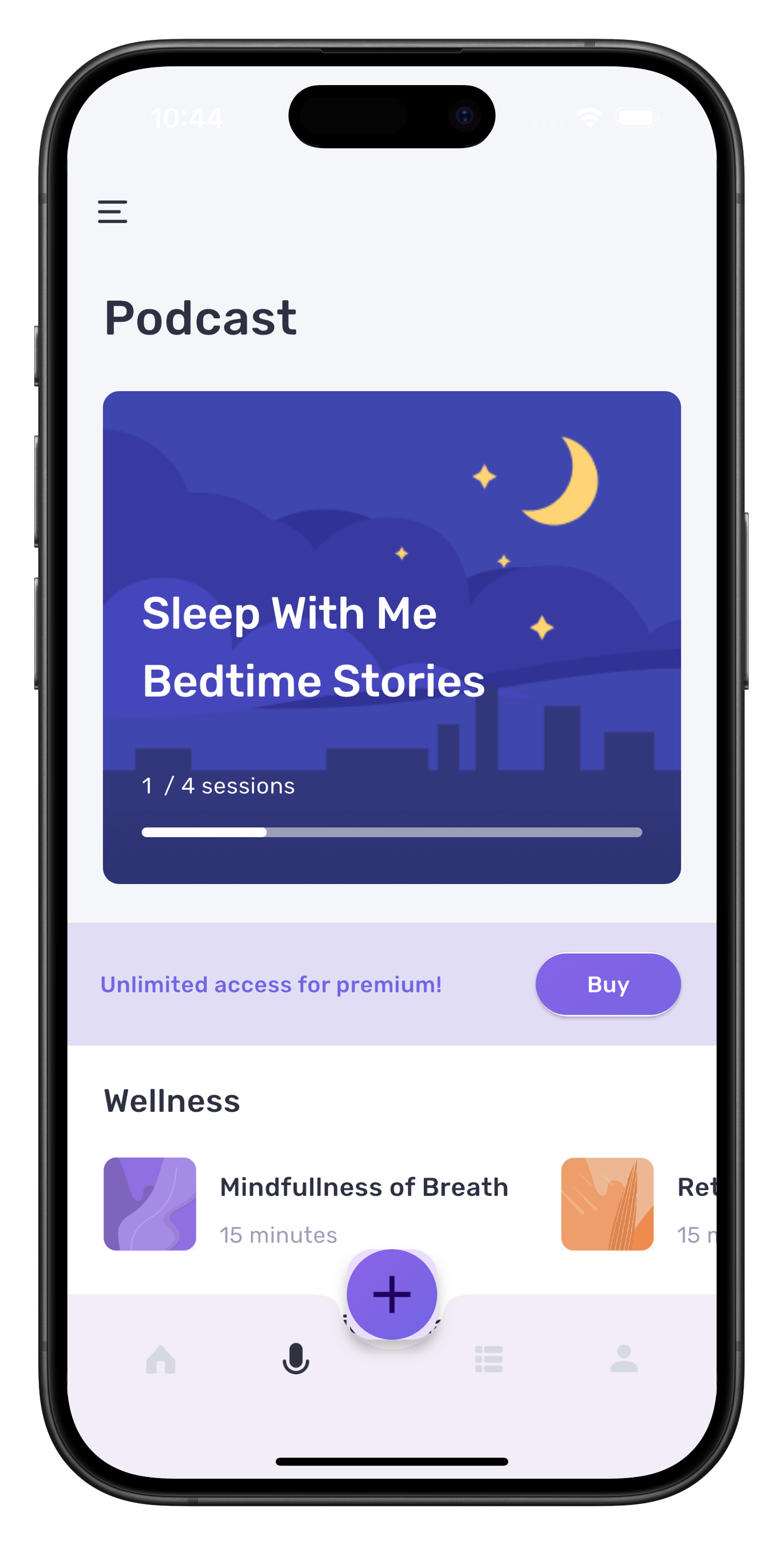
For illustration our fitness app containes the AppContainer widget that implements a bottom navigation bar, enhancing the app's navigation structure. This feature allows users to switch between main sections of the application easily.
🚀 Key aspects of this implementation:
- Utilizes
BottomAppBarfor the navigation bar structure that can be passed as a value to the parameterbottomNavigationBarof an Scaffold widget.
Feel free to modify or add new IconButton widgets, and configure the icons and onPressed calls to your liking within the Row found in the BottomAppBar as shown in the code snippet below. Additionally, you can explore popular third-party bottom navigation bar libraries like the well-known Persistent Bottom Navigation Bar and others for more options.
- Implements a
FloatingActionButtoncentered within the navigation bar - uses
setStateto handle screen transitions and update the selected widget upon button presses. - Customizes the appearance of navigation icons based on selection
🧩 Code Snippet
Here's the magic that brings this navigation bar to life: (taken from app_container.dart from the fitness app)
class AppContainer extends StatefulWidget {
const AppContainer({super.key});
State<AppContainer> createState() => _AppContainerState();
}
class _AppContainerState extends State<AppContainer> {
ContainerSelection _selection = ContainerSelection.home;
Widget _selectedWidget = const HomeScreen();
Widget build(BuildContext context) {
return Scaffold(
extendBody: true,
appBar: AppBar(
actions: [
if (_selection == ContainerSelection.home)
GestureDetector(
onTap: () => push(context, const NotificationsScreen()),
behavior: HitTestBehavior.translucent,
child: Stack(children: <Widget>[
SizedBox(
width: 40,
height: 40,
child: Image.asset(
'assets/images/user_photo.png',
fit: BoxFit.cover,
),
),
Positioned(
bottom: 14,
left: 1,
child: Container(
decoration: BoxDecoration(
border: Border.all(
color: scaffoldBackgroundColor,
width: 2,
),
color: tealColor2,
shape: BoxShape.circle),
width: 12,
height: 12,
),
)
]),
),
if (_selection == ContainerSelection.profile)
IconButton(
icon: Icon(Icons.settings, color: mainTextColor),
onPressed: () => push(context, const SettingsScreen()),
),
const SizedBox(width: 22)
],
elevation: 0,
backgroundColor: Colors.transparent,
leading: Builder(
builder: (context) => IconButton(
icon: Image.asset(
'assets/images/menu.png',
width: 24,
height: 24,
),
onPressed: () => Scaffold.of(context).openDrawer(),
),
),
iconTheme: IconThemeData(color: mainTextColor),
),
bottomNavigationBar: BottomAppBar(
clipBehavior: Clip.antiAlias,
shape: const CircularNotchedRectangle(),
notchMargin: 6,
child: Row(
mainAxisSize: MainAxisSize.max,
mainAxisAlignment: MainAxisAlignment.spaceAround,
children: <Widget>[
IconButton(
icon: Image.asset(
'assets/images/home.png',
width: 24,
height: 24,
color: _selectedWidget is HomeScreen
? mainTextColor
: unselectedTabIcon,
),
onPressed: () {
_selectedWidget = const HomeScreen();
setState(() {
_selection = ContainerSelection.home;
});
},
),
IconButton(
icon: Image.asset(
'assets/images/mic.png',
width: 24,
height: 24,
color: _selectedWidget is PodCastScreen
? mainTextColor
: unselectedTabIcon,
),
onPressed: () {
_selectedWidget = const PodCastScreen();
setState(() {
_selection = ContainerSelection.podCast;
});
},
),
const SizedBox(),
IconButton(
icon: Image.asset(
'assets/images/community.png',
width: 24,
height: 24,
color: _selectedWidget is CommunityScreen
? mainTextColor
: unselectedTabIcon,
),
onPressed: () {
_selectedWidget = const CommunityScreen();
setState(() {
_selection = ContainerSelection.community;
});
},
),
IconButton(
icon: Image.asset(
'assets/images/profile.png',
width: 24,
height: 24,
color: _selectedWidget is ProfileScreen
? mainTextColor
: unselectedTabIcon,
),
onPressed: () {
_selectedWidget = const ProfileScreen();
setState(() {
_selection = ContainerSelection.profile;
});
},
),
],
),
),
floatingActionButton: FloatingActionButton(
child: Container(
width: 62,
height: 62,
decoration: BoxDecoration(
shape: BoxShape.circle,
gradient: LinearGradient(
begin: Alignment.topLeft,
end: Alignment.bottomRight,
colors: [buttonGradientColorBegin, colorPrimary],
)),
child: const Icon(
Icons.add,
size: 40,
),
),
onPressed: () => showGeneralDialog(
barrierDismissible: true,
barrierLabel:
MaterialLocalizations.of(context).modalBarrierDismissLabel,
barrierColor: Colors.black45,
transitionDuration: const Duration(milliseconds: 200),
context: context,
pageBuilder: (context, animation, secondaryAnimation) {
return const AddMealScreen();
}),
),
floatingActionButtonLocation: FloatingActionButtonLocation.centerDocked,
);
}
}
The Drawer

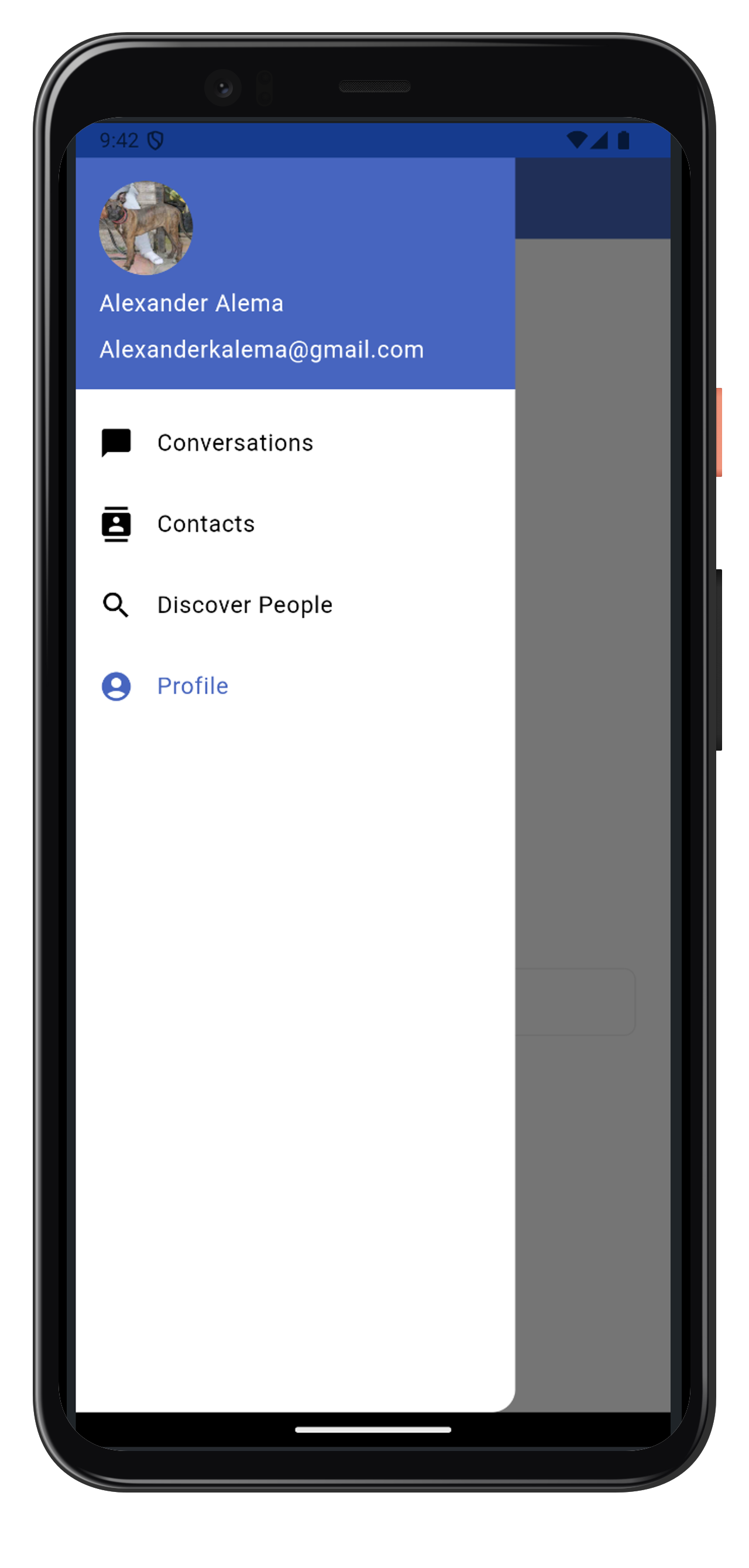
The ContainerScreen widget in your instaflutter app introduces a drawer navigation feature, enhancing the app's user interface and improving navigation between different sections. This implementation utilizes Flutter's Drawer widget in conjunction with BlocConsumer for state management.
🚀 Key components of this implementation:
- An enum
DrawerSelectionto manage different drawer states
Include more enum values here to add more drawer items. For example: our Shopertino flutter app has a differnet enums as follows
enum DrawerSelection {
home,
shop,
bag,
search,
orders,
wishList,
profile,
logout
}
Once you add them here, make sure to add the ListTile for it as well and define its onPress callback function
- A stateful
ContainerScreenwidget that maintains the current user and drawer selection - A
BlocConsumerthat listens for state changes and updates the UI accordingly - A customized
Drawerwidget with a header displaying user information and navigation options
Each section is represented by a ListTile in the drawer, which triggers a state change when tapped. The app bar title and main content area update dynamically based on the selected drawer item.
🧩 Code Snippet
Here's the code that brings this functionality to life: (taken from container_screen.dart from the social network app)
enum DrawerSelection { conversations, contacts, search, profile }
class ContainerScreen extends StatefulWidget {
final User currentUser;
const ContainerScreen({Key? key, required this.currentUser})
: super(key: key);
State<ContainerScreen> createState() => _ContainerState();
}
class _ContainerState extends State<ContainerScreen> {
late User currentUser;
DrawerSelection _drawerSelection = DrawerSelection.conversations;
String _appBarTitle = 'Conversations'.tr();
late Widget _currentWidget;
void initState() {
super.initState();
currentUser = widget.currentUser;
_currentWidget = ConversationsWrapperWidget(currentUser: currentUser);
}
Widget build(BuildContext context) {
return ChangeNotifierProvider.value(
value: currentUser,
child: BlocProvider(
create: (context) => HomeBloc(),
child: Builder(builder: (context) {
return BlocConsumer<HomeBloc, ContainerState>(
listener: (context, state) {
if (state is ChangeScreenState) {
Navigator.pop(context);
_currentWidget = state.currentScreen;
_appBarTitle = state.appBarTitle;
_drawerSelection = state.drawerSelection;
}
},
builder: (context, state) {
return Scaffold(
drawer: Drawer(
child: ListView(
padding: EdgeInsets.zero,
children: [
Consumer<User>(
builder: (context, user, _) {
return DrawerHeader(
decoration: const BoxDecoration(
color: Color(colorPrimary),
),
child: Column(
crossAxisAlignment: CrossAxisAlignment.start,
children: [
displayCircleImage(
user.profilePictureURL, 65, false),
Padding(
padding: const EdgeInsets.only(top: 8.0),
child: Text(
user.fullName(),
style: const TextStyle(color: Colors.white),
),
),
Padding(
padding: const EdgeInsets.only(top: 8.0),
child: Text(
user.email,
style:
const TextStyle(color: Colors.white),
)),
],
),
);
},
),
ListTile(
selected:
_drawerSelection == DrawerSelection.conversations,
title: const Text('Conversations').tr(),
onTap: () => context.read<HomeBloc>().add(
ChangeScreenEvent(
appBarTitle: 'Conversations'.tr(),
currentScreen: ConversationsWrapperWidget(
currentUser: currentUser,
),
drawerSelection:
DrawerSelection.conversations)),
leading: const Icon(Icons.chat_bubble),
),
ListTile(
selected: _drawerSelection == DrawerSelection.contacts,
leading: const Icon(Icons.contacts),
title: const Text('Contacts').tr(),
onTap: () => context.read<HomeBloc>().add(
ChangeScreenEvent(
appBarTitle: 'Contacts'.tr(),
currentScreen:
ContactsScreenWrapper(user: currentUser),
drawerSelection: DrawerSelection.contacts)),
),
ListTile(
selected: _drawerSelection == DrawerSelection.search,
title: const Text('Discover People').tr(),
leading: const Icon(Icons.search),
onTap: () => context.read<HomeBloc>().add(
ChangeScreenEvent(
appBarTitle: 'Discover People'.tr(),
currentScreen: DiscoverPeopleScreenWrapper(
user: currentUser),
drawerSelection: DrawerSelection.search)),
),
ListTile(
selected: _drawerSelection == DrawerSelection.profile,
leading: const Icon(Icons.account_circle),
title: const Text('Profile').tr(),
onTap: () => context.read<HomeBloc>().add(
ChangeScreenEvent(
appBarTitle: 'Profile'.tr(),
currentScreen: ProfileScreen(user: currentUser),
drawerSelection: DrawerSelection.profile)),
),
],
),
),
appBar: AppBar(
title: Text(
_appBarTitle,
),
actions: [
if (_appBarTitle == 'Conversations'.tr())
IconButton(
icon: const Icon(Icons.group_add),
onPressed: () {
push(
context,
CreateGroupWrapperWidget(
currentUser: currentUser,
colorPrimary: const Color(colorPrimary),
colorAccent: const Color(colorAccent),
));
},
color: isDarkMode(context)
? Colors.grey.shade200
: Colors.white,
tooltip: 'Create Group Chat'.tr(),
)
],
),
body: SafeArea(child: _currentWidget),
);
},
);
}),
),
);
}
}
This implementation demonstrates a clean and efficient way of using a drawer navigation in our instaflutter app, improving user experience and app structure.
The Loading Indicator

Our Flutter templates incorporate a customizable loading indicator to enhance user experience during asynchronous operations. This feature utilizes the flutter_easyloading package for a smooth and visually appealing loading animation.
🚀 Key aspects of this implementation:
- Customizable appearance including color, size, and animation type
- Ability to show, update, and hide the loading indicator
- Option to make the loading indicator dismissible or non-dismissible
- Integration with state management (Cubit in this example) for easy control
🧩 Code Snippet
Here are the core methods for managing the loading indicator: (taken from helper.dart from the social network app)
// Show progress
void showProgress(BuildContext context, String message, bool isDismissible, Color colorPrimary) {
  EasyLoading.instance
    ..displayDuration = const Duration(milliseconds: 2000)
    ..indicatorType = EasyLoadingIndicatorType.fadingCircle
    ..loadingStyle = EasyLoadingStyle.custom
    ..indicatorSize = 45.0
    ..radius = 10.0
    ..progressColor = Colors.white
    ..backgroundColor = colorPrimary.withOpacity(0.7)
    ..indicatorColor = Colors.white
    ..textColor = Colors.white
    ..maskColor = Colors.black.withOpacity(0.5)
    ..userInteractions = isDismissible
    ..dismissOnTap = isDismissible;

  EasyLoading.show(status: message);
}

// Update progress
void updateProgress(String message) {
  EasyLoading.showProgress(0.5, status: message);
}

// Hide progress
void hideProgress() {
  EasyLoading.dismiss();
}
To manage the loading indicator and use it throughout the app, you can use the following LoadingCubit: (taken from login_cubit.dart from the social network app)
import 'package:bloc/bloc.dart';
import 'package:flutter/cupertino.dart';
import 'package:instaflutter/core/utils/helper.dart';

part 'loading_state.dart';

class LoadingCubit extends Cubit<LoadingIndicatorState> {
  LoadingCubit() : super(LoadingInitial());

  void showLoading(BuildContext context, String message, bool isDismissible,
      Color colorPrimary) {
    showProgress(context, message, isDismissible, colorPrimary);
  }

  void hideLoading() {
    hideProgress();
  }
}
💡 Usage Example
Here's how you can use the loading cubit in your code: (taken from login_screen.dart from the social network app)
onPressed: () async {
  context.read<LoadingCubit>().showLoading(
    context,
    'Logging in, Please wait...'.tr(),
    false,
    const Color(colorPrimary),
  );

  context.read<AuthenticationBloc>().add(
    LoginWithEmailAndPasswordEvent(
      email: email!,
      password: password!,
    ),
  );
},
Firebase Usage Illustration
Throughout your instaflutter app you will see implementaion of firebase done for authentication, real-time database, and cloud functions. Here are some key implementations:
Authentication
- Our authentication system leverages Firebase Auth for secure and efficient user login. (taken from
auth_firebase.dartfrom the dating app)
import 'package:firebase_auth/firebase_auth.dart' as auth;
import 'package:firebase_messaging/firebase_messaging.dart';
import 'package:firebase_storage/firebase_storage.dart';
class AuthFirebaseUtils extends AuthenticationRepository {
FirebaseMessaging firebaseMessaging = FirebaseMessaging.instance;
FirebaseFirestore firestore = FirebaseFirestore.instance;
Future<dynamic> loginWithEmailAndPassword(String email, String password) async {
try {
auth.UserCredential result = await auth.FirebaseAuth.instance
.signInWithEmailAndPassword(email: email, password: password);
DocumentSnapshot<Map<String, dynamic>> documentSnapshot = await firestore
.collection(usersCollection)
.doc(result.user?.uid ?? '')
.get();
User? user;
if (documentSnapshot.exists) {
user = User.fromJson(documentSnapshot.data() ?? {});
user.active = true;
user.pushToken = await firebaseMessaging.getToken() ?? '';
await _updateCurrentUser(user);
}
return user;
} on auth.FirebaseAuthException catch (e, s) {
// Error handling logic...
}
}
}
Firestore and Cloud Function Operations
- For data management and server-side logic. we utilize Firebase Firestore and Cloud Functions. The following example showcases how we handle swipes and fetch dating recommendations: (taken from
dating_firebase.dartfrom the dating app)
class DatingFireStoreUtils extends DatingRepository {
final FirebaseFunctions functions = FirebaseFunctions.instance;
final FirebaseFirestore firestore = FirebaseFirestore.instance;
final List<StreamSubscription> datingStreamSubs = [];
Future<DatingUser?> addSwipe({
required String swipedProfileID,
required String authorID,
required String type
}) async {
var result = await functions.httpsCallable('addUserSwipe').call({
'swipedProfileID': swipedProfileID,
'authorID': authorID,
'type': type,
});
if (result.data != null) {
return DatingUser.fromJson(Map<String, dynamic>.from(result.data));
} else {
return null;
}
}
Future<List<DatingUser>> getDatingRecommendations(
{required String currentUserID}) async {
var result = await firestore
.collection(datingRecommendationsCollection)
.doc(currentUserID)
.collection(recommendationsCollection)
.get();
List<DatingUser> users = [];
try {
for (var user in result.docs) {
users.add(DatingUser.fromJson(user.data()));
}
} catch (e, s) {
debugPrint('DatingFireStoreUtils.getDatingRecommendations $e $s}');
}
return users;
}
}
The above are samples taken showcase how we have used Firebase services into our app, handling authentication, Firestore operations, and cloud functions. There are similar patterns of these usages through out the apps.
To use these firebase functions you should initalize it first. You can see it done in your main.dart file:
void main() async {
  WidgetsFlutterBinding.ensureInitialized();
  await Firebase.initializeApp();
  runApp(MyApp());
}